Spotify

Spotify iOS App
NEW SOCIAL FEATURE
Client: Spotify
Timeline: 2 weeks (April 2019)
Scope: User Research, Strategy, UI Design, iPhone App Prototype, Interaction Design and Usability Testing
Role: UX/UI Designer
Team: Self-directed, with feedback from mentor and peers
Tools: Sketch, Marvel
The Challenge:
Spotify is the group lead and it wants to stay that way. For this reason, they want to improve engagement and retention in the app. In order to do that, they want to expand on their social capabilities.
This is a speculative project, and I am not affiliated with Spotify.
The Objectives:
To design social features for Spotify’s mobile app
To follow Spotify’s existing design patterns
To provide a working prototype that smoothly integrates the new features into the current app


Research
Market Research | Competitive Analysis | Heuristic Evaluation | User Interviews | Empathy Map
Market Research
I began my research by developing a better understanding of the music streaming industry, Spotify’s positioning within the industry and Spotify’s user demographics. I also researched more about Spotify’s current features and removed features, specifically their messaging feature which was removed because of “low engagement and high maintenance costs”. It was important to understand why this feature was removed while moving forward with my design.
Current Social Features…
Spotify Codes - QR code to scan & share
Share via Messages, Instagram Stories, Facebook Messenger, Facebook & Twitter
Share via copy link & paste wherever you want to share
Competitive Analysis
Next I needed to better understand the strengths & weaknesses with the competition and identify any gaps that Spotify may be able to fill with a new feature. I explored each app on a mobile device and researched each company to learn more about what their app offers.
Heuristic Evaluation
After learning more about the competition, I conducted a heuristic evaluation to gain a clear grasp on the apps current architecture, hierarchy, features and usability. This was important to know in order to design the feature seamlessly and with good usability.
User Interviews
With this understanding of the market, product, and competition, I then conducted user interviews to get a deeper understanding of Spotify’s users. I spoke with 5 Spotify users (2 female, 3 male, ages 20-35) about their music listening habits and their experiences using Spotify Premium.
Empathy Map
To synthesize my findings from the user interviews, I created an empathy map by writing out each observation from the interviews onto individual sticky notes. This helps me organize my findings into insights and define user needs.
Define
Persona | POV Statements & HMW Questions
Persona
To develop a representation of the user based off of the user research I conducted, I created this persona Luke. I pulled the demographics based off of the people I interviewed and identified his needs, goals, motivations & frustrations from patterns within the empathy map. This is a way for me to reference back to the persona to help make design decisions based off my user research.
POV Statements & HMW Questions
Next, I needed to understand the user’s point of view before attempting to solve a problem. Then, I framed the point of view statements into How Might We questions so I can focus on finding solutions that answer these questions.
Ideate
Group Brainstorm | Project Goals | Product Roadmap | Site Map | User Flow | UI Requirements
Group Brainstorm
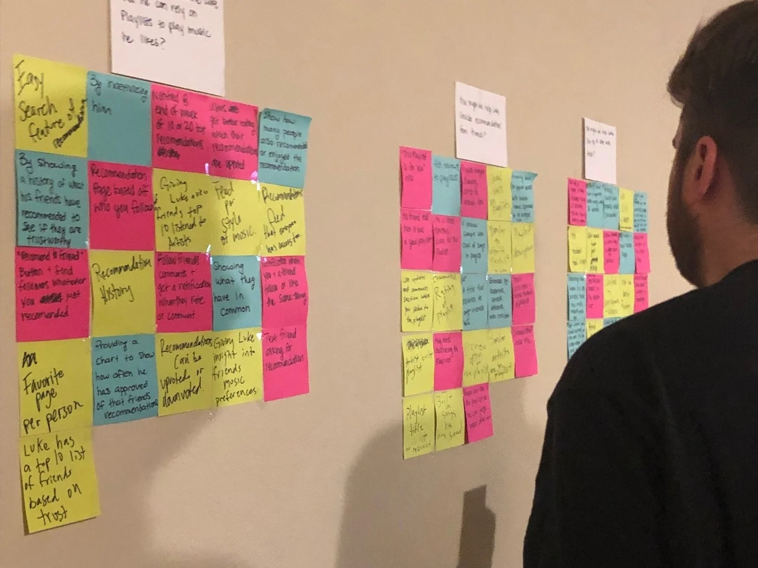
To generate solutions in a greater depth, I gathered a group of people together to conduct a group brainstorm activity following IDEO’s group brainstorm rules. This method helps generate more unique solutions by talking through ideas and getting inspiration from one another. I focused on leading the group through a judgement free atmosphere and encouraged wild ideas.


Project Goals
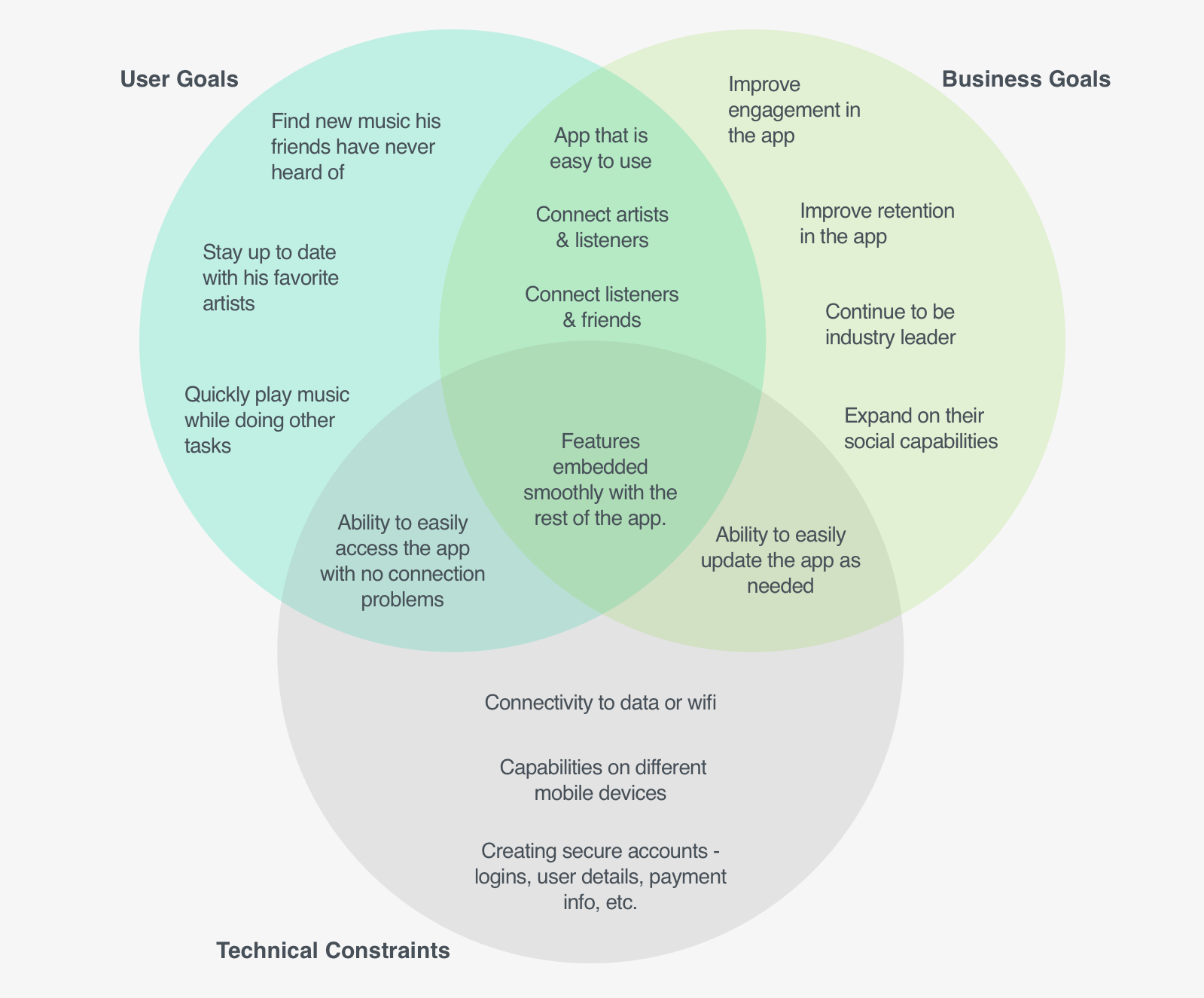
I identified the business goals, user goals, and technical constraints into a venn diagram in order to identify mutual goals. These mutual goals show what needs to be achieved in the design without swinging to satisfy one side or the other.

Product Roadmap
I created a product roadmap to define and prioritize features that will address each of the HMW questions. I identified the features from the brainstorming activity that best solve each HMW question. Then, I prioritized each HMW question and related features by looking back at the mutual goals and defining which are the most feasible, desirable, and impactful.
Site Map
I then created a site map to showcase the app structure and how the new features/screens will be seamlessly integrated into the site. I decided to focus on priority 1 due to time constraints. This included a recommend button, a people you follow section, and more prominent profile pages. You can see the new screens are highlighted in green below.
User Flow
Once I had a strong understanding of the app structure, I created a user flow to identify all the paths a user could take to complete tasks using the new features. This helps me understand the relationship between the screens and which UI elements were nessicary for the new features.
Design
Sketches | Brand Identity | Wireframes
Sketches
Now that I identified the key screens users would need to complete the tasks, I began sketching the new feature and pages while adhering to the existing design patterns within the app that users are already familiar with.
Brand Identity
Before creating high-fidelity wireframes, I needed to understand Spotify’s branding guidelines to ensure a seamless integration of the new features. I collected my findings into a mood board and put together this style tile to reference while designing.
Wireframes
Next, I created the high fidelity wireframes of the new features including the ability to recommend any song, artist or playlist to followers, people you follow & artist you follow sections on the home page, and lastly a more prominent profile page. I was able to digitize my design by matching the UI elements to the existing design patterns.
Prototype
High Fidelity Prototype
High Fidelity Prototype
I then used the wireframes to create a working prototype in Marvel that I can access on a mobile device to use while conducting the usability test.
Test & Refine
Usability Testing | Affinity Map | UI Kit | Revisions
Usability Test
Overview:
I conducted usability testing at a local coffee shop, recruiting 5 participants. I had to overcome some tech issues while testing where I learned how valuable it can be to have multiple ways of recording the testing.
3 Males, 2 Females
Ages 25-25
Goals:
Discover if users can navigate through the new features
Discover if users can find their profile
Discover if users can navigate to others profiles
Identify any pain points users encounter with the new features
Tasks:
Find a new song your friend Lena has recommended to all of her followers
Find a new song that your friend Lena has directly recommended to you
Recommend the current song you are listening to to your friend Lena
View your friend Lena’s most recently played artists

Affinity Map
To synthesize my findings from the usability test, I created an affinity map where I identified patterns that I observed. I then pulled three insights that helped me identify three recommendations to make to the design.
UI Kit
Throughout the process, I created a UI Kit to keep all the UI elements into one document for future reference when designing. All existing elements were recreated in Sketch and new elements were based off the existing UI.
Revisions
Finally, I made priority revisions to my high-fidelity wireframes and Marvel prototype to reflect the recommendations from the affinity map.
Final Prototype
Reflection
During this project, I found it difficult to identify and design new features into an already defined structure and interface. I had to learn why Spotify had made their recent changes to simplify their interface before I could start designing. Once I understood, I didn’t want to add a feature that was going to disrupt the app’s information architecture and overall interface because that could cause more confusion to it’s users. I studied their interface and features in order to seamlessly design the new features.
I also learned how important it is to focus on a select group of features in order to avoid feature creep. When you try to design for all, it becomes overwhelming and more difficult to clearly define and design each feature.
Next Steps
Beta testing with users of new features to determine engagement
Handoff of design deliverables to development team
